The O3 (Ozone) Digital Capacity Model assesses your web team's ability to deliver across 3 levels of activity:
- Online
- Operations
- Organisation
(Read a detailed explanation of categories at the bottom of the page.)
The model works by benchmarking key inputs and outputs, and exposes holes in your capacity and resourcing.
Deploying the model is easy. Simply evaluate delivery against the criteria within each category and then grade the results: Red, Amber or Green. The grades indicates risks in your team's capacity.
I have been using this model for several years and it has been superb for grabbing the attention of senior managers. Not only are the results very clear, but they are easily presentable on a single slide (as illustrated below). This clarity just seems to draw senior managers' interest and compels them to focus on web.
(Find out below why it is called the 'Ozone' or 'O3' model below.)
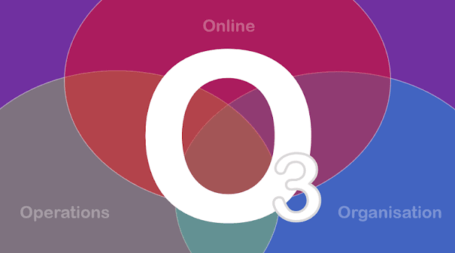
O3 (Ozone) Digital Capacity Model
- Online: This category benchmarks your website against common delivery standards, e.g. UX, content design, accessibility, performance, security, etc. The basic question is - "does your website meet the minimum standards of quality and experience your users expect?" If not, why not? Where are the holes?
- Operations: This category benchmarks web processes, people/skills, tools, management practices, etc. The basic question is - "does your team have the capacity to carry out all essential maintenance activities based on the scale of your site?" If not, why not? Where are the holes?
- Organisation: This category benchmarks strategy, governance, financing, etc. The basic question is - "does your organisation have the capacity to get the most from its web investment, i.e. is it digitally literate?" If not, why not? Where are the holes?
A list of the detailed scoring criteria is at the bottom of this page.
Example of results from the O3 (Ozone) Model
Download a Powerpoint slidedeck with an example of results (PPTX 65KB).

For example, if a review of Operations reveals that your team has inadequate skills or follows shaky processes, you may grade it as Amber. This grade indicates that your current standard of delivery is poor and that your capacity to deliver is at risk.
Senior managers must then decide whether they accept that risk (and the impact it entails) - or if they will invest in the resources needed to raise standards.
Why digital capacity matters
The scale of demands placed on many web teams is utterly overwhelming. There is simply too much to do and not enough people, time or funding to do it all. (Read my post 'Why digital government is failing - and how to fix it'.)
Yet outside of digital teams there is little to no awareness of the enormous gulf between expectations and reality. Part of the problem is that we 'digerati' are very bad at making the case for increased manpower and funding.
We are typically so flexible and accommodating that - rather than looking for justified increases in resourcing - we simply find ever more creative ways to make do with what we've got.
Guess what happens? Colleagues keep piling on the work, making a bad situation worse.
The truth is that many web teams are stretched so far and have so little redundancy, that almost any issue could bring things crashing down, e.g. staff illness.
This has to stop.
As professional practitioners we need to get much, much better at communicating shortfalls in capacity and how this puts delivery at risk.
The O3 Model can help.
Why the O3 model works
The O3 (Ozone) Model works because it is a convincing.
The 3 categories (the 3 Os) in the model encompass all the elements upon which good digital delivery relies and grades them in a clear way.
It's main strength is how easily it can communicate the totality of your digital position in a straightforward and meaningful way to non-experts.
There is no need for senior managers to understand anything about code, content, design, UX, analytics, technology, etc, etc. The model's 'traffic light' scoring highlights digital risks so clearly that its findings are hard to ignore.
The 3 levels of the model also reflect a useful cascade of dependence.
That is, to be good at Online you need good Operations and to be good at Operations you need a digitally literate Organisation. Fail in any one of the 3 Os and you will likely fail overall.
That's why the model is so useful. Not only does it expose holes in your current capacity, but it can also predict future risks (if things are not fixed).
How to use the results
The most obvious way to use results from the O3 Model is to create a roadmap for improvement across each of the 3 categories, for example:
Inevitably, this all assumes that senior managers will give you the resources you need. In that sense, the best way to use the results is as a business case for web investment.
As noted above, the O3 Model exposes risks so clearly that it gives senior managers nowhere to hide. They have everything they need to make informed decisions about web.
If they accept the model's results but then choose to deflect requests for resourcing, they do so with eyes wide open. If demand continues to grow, quality will decline, risks will increase and ultimately, the site will fail.
Of course, web teams will also continue to go above-and-beyond the call of duty to keep the show on the road - e.g. by prioritising core content and ignoring everything else - but the problem is that many teams are running out of road.
O3 (Ozone) Digital Capacity Model - Detailed Criteria
Online
The category of 'Online' represents your ability to deliver a good website, i.e. the digital property itself. The basic question here is - does our website meet the minimum standards of quality and experience our users expect? Key factors to assess include the following:
- Quality Assurance: Does your site meet minimum accepted standards of quality. This includes typical things like broken links, typos/grammar issues, consistent language (style guide / controlled vocabulary), metadata, image optimisations, etc
- User Experience (UX): Does your site deliver a good experience for users. In particular, do you have good content design, i.e. is content easy to Find, Read, Understand and Action?
- Accessibility: Does you site meet WCAG 2.0 guidelines.
- Functionality: Does your site operate predictably without error
- Performance: Does your site respond with accepted time limits
- Security: Does the side meet standards for Confidentiality, Integrity and Availability.
Explore a complete list of criteria in the Website Manager's Handbook.
Operations
The category of 'Operations' represents your capability to deliver a successful website. The basic question is - are you carrying out all the essential activities of web management using robust and repeatable processes based on the scale of your site.
Key factors to assess include the following:
- People: Do you have the resources in place to adequately cover all essential tasks to the right level of granularity and detail. In particular do you have
- Manpower: The right number of people (whether full-time, consultants, contractors, part time, support from colleagues)
- Skills: Do your people have the expertise and experience to meet required standards
- Teams: Are people organised such that everyone knows what they need to focus on, with well defined roles an responsibilities
- Processes: Do you have documented procedures and standards that allow delivery to happening consistent and reliable way - and also be repeatable and auditable. Can you do it whilst maintaining good relationships with your internal stakeholders
- Tools: Does your team have access to the right tools and other supports needed to do their jobs. This includes everything from CMS, to graphic editing tools to IDEs to style guide and design patterns. Basically, anything your people need to deliver.
Organisation
The category of 'Organisation' stands for the capacity of your organisation to support digital development. The basic question is - is your organisation 'digitally literate' enough to get the most from its web investment?
In my Web Masterclass, I have written that the detachment of senior managers from web is one of the biggest risks to successful delivery.
Many senior decision makers have little awareness of the effort needed to maintain a sophisticated, modern website. Yet, they consistently demand the highest of standards and are often amazed when their expectations cannot be met.
This mismatch places huge pressure on web teams. The only thing that often keeps the show on the road is the flexibility and adaptability of staff.
The Ozone Model helps expose this incoherence and brings senior managers closer to web.
Some key factors to consider are:
- Digital strategy: Do you have one? How clear is it? Is it achievable or just a set of vague aspirations?
- Governance: Do you have robust and informed systems to support decision making, e.g. which goals to focus on, how this impacts resourcing?
- Authority: Do you have the authority needed to direct web without undue interference - especially in UX and design decisions (to help circumvent the endless time wasted debating homepages).
- Funding: Do you have access to the minimum funds necessary to deliver on your strategy?
Why "Ozone"?
The model assesses digital delivery and capacity across 3 interrelated categories, each of which happens to begin with the letter 'O'- Online, Operations, Organisation. Thus we get 3 Os.
It also happens that O3 is the chemical symbol for Ozone - a substance known to have developed several unfortunate holes over the years.
Putting it all together, the name seemed to suggest itself.
This model developed from a framework I created about a decade ago. See my article 'How to weaponise your web governance' for more.
Labels: Content Design